A strip chart, also known as a strip plot, is a visual tool for recording and displaying data over time. Traditionally used in engineering and scientific fields to monitor continuous processes, strip charts allow users to observe changes and fluctuations in real time. The design of a strip chart involves plotting data points along a timeline, providing a clear visual representation of trends and patterns. This simplicity makes it an effective method for tracking data, as it enables quick interpretation.
Today, strip charts remain relevant across various industries, including research, healthcare, and manufacturing. In healthcare, for example, they can track patient vital signs, helping providers identify trends in patient conditions. Their ease of use and effectiveness in visualizing data make strip charts an invaluable tool for professionals seeking to understand dynamic processes and make informed decisions.
What is a Strip Chart?
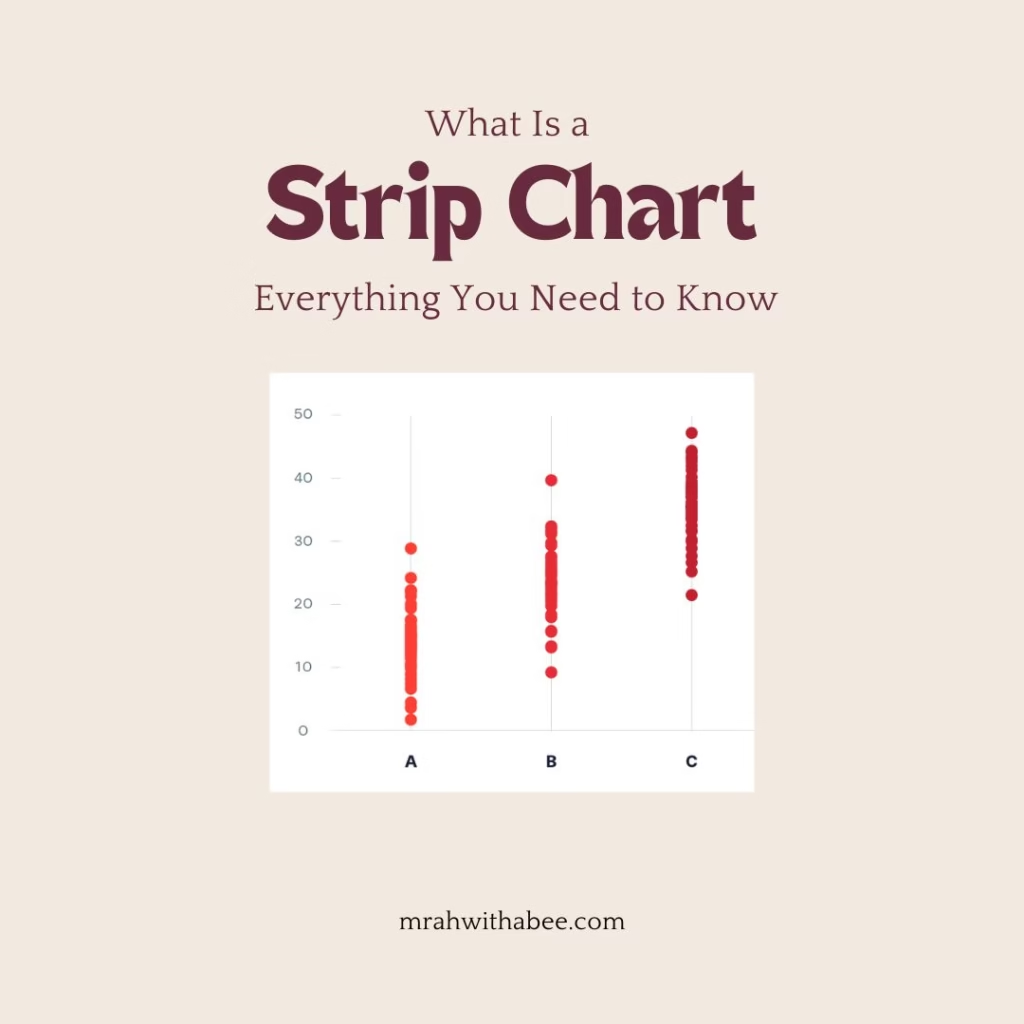
A strip chart is a type of chart that presents quantitative data on a single sheet. Similar to traditional charts, strip charts help visualize collected data effectively. They are beneficial when sample sizes are small enough to display individual data points.
A chart recorder is a device designed to capture mechanical or electronic trends onto a roll of paper. These recorders can simultaneously track multiple inputs, using different colored markers to differentiate between data sets, making them compatible with strip and circular charts.
Components
A strip chart consists of several essential elements that contribute to its functionality and clarity. These include:
- Axis: A strip chart can feature up to four coordinate axes, each consisting of an axis line, title, ticks, and labels. These axes provide a framework for interpreting the data.
- Crosshairs: Crosshairs are utilized to position the pointer in relation to the coordinate axes. They consist of perpendicular lines drawn within the graphing area, aiding in precise data point identification.
- Elements: An element represents a collection of data points. The appearance of these elements—including their symbols, line thickness, and color—can be customized based on the definitions of the strip plot.
- Grid: The grid extends both large and small ticks from the X-axis and/or Y-axis across the charting area, helping to define the layout and enhance readability.
- Legend: The legend displays the names and symbols of each data entity. It can be positioned anywhere along the margins or within the charting area for easy reference.
- Marker: Markers are used to annotate, highlight, and emphasize specific areas within the strip chart, drawing attention to important data points or trends.
- Pen: Pens indicate how data components are rendered on the chart. Multiple pens can be used simultaneously for different data elements, allowing for varied visual representations.
-
Postscript: This component enables the generation of enclosed script output, offering numerous options for customizing how the output is produced and presented.
Differences from Other Charts
Strip charts differ significantly from other types of charts, such as bar or pie charts. While bar and pie charts emphasize discrete categories or proportions at a single point in time, strip charts are specifically designed to highlight real-time or historical trends over extended periods. This focus on continuous data makes strip charts particularly valuable for monitoring processes, identifying long-term patterns, and analyzing fluctuations in various fields, including engineering, healthcare, and environmental studies.
By emphasizing the relationship between time and data values, strip charts provide insights that categorical charts may overlook, enabling users to make informed decisions based on observed trends.
Strip Chart Recorder

A chart recorder is a specialized instrument used to capture and document various processes and electrical signals. Traditionally, these devices record data on paper, making them essential in fields like engineering, manufacturing, and environmental monitoring.
In operation, the paper moves continuously beneath a pen that responds to signal fluctuations. As the pen deflects, it creates a real-time graph that visually represents the data, allowing users to track changes and identify trends.
Modern chart recorders can record multiple inputs simultaneously, often using different colored pens for clarity. While traditional paper-based models are still in use, many contemporary devices have transitioned to digital formats, enhancing accuracy and ease of analysis.
Working Mechanism
A chart recorder is an electro-mechanical device designed to capture electrical or mechanical input trends onto a piece of paper, commonly referred to as a chart. These recorders can track multiple inputs simultaneously, often using different colored pens, and can produce either strip charts or circular charts.
Chart recorders come in three primary formats:
- Strip Chart Recorders: These devices use a long strip of paper that is continuously ejected from the recorder, allowing for extended data recording.
- Circular Chart Recorders: These feature a rotating disc of paper, which needs to be replaced more frequently. They are more compact and can often be housed behind glass for protection.
- Roll Chart Recorders: Similar to strip chart recorders, roll chart recorders store recorded data on a round roll of paper. These units are typically fully enclosed to protect the internal mechanisms.
Chart recorders can be purely mechanical, incorporating clockwork mechanisms; electro-mechanical, utilizing electrical clockwork to drive the chart while handling mechanical or pressure inputs; or fully electronic, which function without any mechanical components (often referred to as virtual chart recorders).
Principle
The DC input signal to the recorder undergoes filtering before being amplified by the pre-amplifier to a level that minimizes susceptibility to noise and interference. This conditioned signal is then fed into the servo amplifier, which continuously compares it to the feedback signal generated by the servo potentiometer.
The difference between these two signals creates a positive or negative error signal. This error signal is amplified and used to drive the servo motor, which is connected to the servo potentiometer, in a direction that aims to reduce the error signal to zero. Because the pen on the recorder plate is mechanically linked to both the servo motor and the servo potentiometer, its position on the chart provides an accurate and continuous graphic representation of the input signal.
Power Supply
- AC voltage is reduced by step-down transformers.
- Converted to DC using solid-state rectifiers and regulators.
- Stable DC voltage from a temperature-compensated zener diode serves as the zero reference for the servo potentiometer.
Pen Drive System
- DC servo motor controls the servo potentiometer and recorder pen via a gear-driven drum assembly.
- The pen is attached to a drive cable wrapped around the drum, moving proportionately with drum rotation.
- Uses pulse-modulated servo technology for improved accuracy and reduced deadband.
Chart Drive System
- The internal crystal oscillator generates pulses, divided by integrated circuit logic.
- The chart speed switch selects the pulse rate to drive the stepper motor.
- Chart speeds are independent of line frequency, ensuring consistent performance.
Types of Strip Charts
Analog Strip Charts

Analog strip charts are the traditional form of strip charts, typically made of paper. These charts are used for manual recordings of data over time and are often employed in settings where continuous monitoring is necessary. Users can visually analyze trends and changes by observing the plotted data points produced by mechanical or electronic devices. While they are straightforward to interpret, analog strip charts may be limited by the accuracy and resolution of the manual recording process.
Examples
- Medical Chart Recorders:
Used in hospitals to monitor patient vital signs, such as heart rate and blood pressure. These devices produce continuous paper records that allow healthcare professionals to track changes over time. - Industrial Process Monitors:
Employed in manufacturing settings to record parameters like temperature, pressure, and flow rates. These analog strip charts help operators visualize process stability and identify potential issues. - Environmental Monitoring Instruments:
Devices that track environmental conditions, such as air quality or water levels, often use analog strip charts to provide a continuous record of changes, making it easier to analyze trends over time. - Seismographs:
Analog strip charts are used in seismology to record ground movements during an earthquake. The chart provides a visual representation of seismic activity, helping researchers analyze the intensity and duration of tremors. - Chemical Process Control:
In laboratories, analog strip charts can record chemical reaction parameters, such as pH levels or concentration changes, allowing researchers to monitor experiments in real-time. -
Thermal Imaging Recorders:
These devices can produce analog strip charts that track temperature changes in materials or environments, often used in building inspections or industrial applications.
Digital Strip Charts
Digital strip charts represent a modern advancement in data visualization, created using specialized software. These charts offer higher accuracy and flexibility compared to their analog counterparts. Digital strip charts can automatically record and process data in real time, allowing for more precise tracking of trends and anomalies. Additionally, they often feature customizable settings, enabling users to adjust parameters such as time intervals, data presentation styles, and scaling options, thus enhancing overall usability and functionality.
Examples
- Laboratory Data Acquisition Systems:
Monitor and record experimental data (e.g., temperature, pressure) in real-time, allowing for easy analysis and export. - Industrial Automation Monitoring:
Track machine performance metrics (e.g., speed, efficiency) to optimize production processes with real-time data. - Environmental Data Logging:
Record air quality, humidity, and temperature data over time, aiding in environmental assessments and compliance. - Healthcare Monitoring Systems:
Display continuous patient vital signs (e.g., ECG readings) to provide immediate feedback for timely interventions. - Energy Management Systems:
Monitor energy consumption and generation in smart grid applications, enabling better management and forecasting. - Remote Monitoring Solutions:
Track parameters like water or tank levels remotely, accessible via the internet for analysis and reporting. -
Software Development and IT Monitoring:
Visualize system performance metrics (e.g., CPU usage, network traffic) to manage IT resources proactively.
Real-time vs. Historical Charts
Strip charts can be categorized into real-time and historical types based on the data they represent:
Real-time Strip Charts
These charts display live data as users collect it, providing immediate insights into ongoing processes. This is particularly useful in applications such as industrial monitoring, where timely data can inform quick decision-making.
Historical Strip Charts
In contrast, historical strip charts represent past data trends over a specified period. These charts are valuable for analyzing long-term performance, identifying patterns, and conducting retrospective studies. They help users understand how processes have evolved and can inform future strategies.
Applications of Strip Charts
Scientific Research
Strip charts are invaluable in scientific research for monitoring experiments and analyzing results over time. They allow researchers to visualize data trends, making it easier to identify anomalies or patterns that may emerge during experiments. For instance, a strip chart can track the progression of chemical reactions, providing a continuous record that supports hypothesis testing and data interpretation.
Industrial Applications
In industrial settings, operators use strip charts to track equipment performance and ensure quality control. By continuously recording parameters such as machine speed, temperature, and output rates, operators can quickly detect deviations from normal operating conditions. This real-time monitoring helps maintain efficiency, reducing downtime, and ensuring that products meet quality standards.
Environmental Monitoring
Strip charts play a crucial role in environmental monitoring by measuring changes in key metrics like temperature, humidity, and air quality. Environmental scientists can utilize these charts to observe trends over time, enabling them to assess the impact of industrial activities, climate change, or pollution. This data is essential for making informed decisions regarding environmental protection and policy formulation.
Healthcare
In healthcare, providers use strip charts to record patient vital signs, such as heart rate, blood pressure, and respiratory rates. Continuous monitoring using strip charts allows healthcare professionals to quickly assess a patient’s condition and respond to any significant changes. This capability is vital in acute care settings, where timely interventions can significantly impact patient outcomes.
Benefits of Using Strip Charts
Visual Representation
Strip charts provide a simplified visual representation of data trends over time. By plotting data points along a timeline, they allow users to quickly grasp complex information in an easily digestible format. This visual clarity highlights patterns, fluctuations, and anomalies that raw data tables might otherwise obscure. Researchers and analysts can use these charts to present findings effectively, making them particularly useful in reports and presentations.
Ease of Interpretation
One of the key advantages of strip charts is their ability to offer clear insights for a diverse range of audiences. Whether for technical experts, management, or stakeholders with varying levels of expertise, strip charts facilitate understanding by straightforwardly presenting information. The intuitive layout allows viewers to quickly identify trends and draw conclusions, making it easier to communicate critical information and support decision-making processes.
Continuous Monitoring
Strip charts enable continuous monitoring of data, supporting real-time tracking of important metrics. This functionality is crucial in various applications, such as industrial processes, healthcare, and environmental assessments, where timely responses to changing conditions are necessary. By providing immediate visibility into data fluctuations, strip charts empower users to act swiftly and effectively, enhancing operational efficiency and safety.
Limitations of Strip Charts
Limited Resolution with Large Datasets
Strip charts can face challenges when dealing with large datasets, as their resolution may become limited. When users plot numerous data points over an extended period, the chart loses clarity, making it difficult to discern individual values and trends. This limitation can hinder the analysis, particularly when precise measurements are crucial, as overlapping points may obscure important information.
Clutter from Excessive Data Points
Another drawback of strip charts is the potential for clutter when there are excessive data points. As users add more data, the chart can become visually overwhelming, which detracts from its effectiveness. This clutter can challenge users in extracting meaningful insights and can lead to confusion, especially for those unfamiliar with the presented data. Maintaining readability becomes a significant concern, necessitating careful management of the data plotted.
Inadequacy of Comparative Analysis
Strip charts may not be the best choice for comparative analysis across multiple categories. While they effectively display trends over time, they can struggle to represent complex relationships or contrasts between different datasets simultaneously. When users need to compare multiple variables or categories, other chart types—such as bar charts or line graphs—often provide clearer insights and facilitate more straightforward analysis, making it easier to identify relationships and differences.
Conclusion
Strip charts, also known as strip plots, are essential tools for visualizing and recording data over time. They have proven invaluable in fields such as engineering, healthcare, and scientific research, enabling users to monitor continuous processes and observe real-time fluctuations. By plotting data points along a timeline, strip charts offer a clear visual representation of trends and patterns, facilitating quick interpretation and effective communication of complex information.
Their applications span a wide range of industries, from tracking patient vital signs in healthcare to monitoring equipment performance in manufacturing. Despite their many advantages, including ease of use and continuous monitoring capabilities, strip charts do have limitations, particularly when handling large datasets or performing comparative analyses. Users must carefully consider these factors to maximize the effectiveness of strip charts in their data-driven decision-making processes. Overall, the enduring relevance and utility of strip charts underscore their importance as a visualization tool in diverse professional contexts.
FAQs
- What is a strip chart?
A strip chart plots continuous data over time, often for monitoring purposes. - How does a strip chart differ from a line graph?
Strip charts emphasize real-time or sequential data, while line graphs focus on trends. - Where are strip charts commonly used?
In fields like research, industry, healthcare, and environmental monitoring. - Are digital strip charts better than analog ones?
Digital charts offer higher accuracy, flexibility, and storage options. - Can strip charts handle large datasets?
They work best for continuous data but may struggle with excessive clutter. - What tools can create strip charts?
Excel, Python (Matplotlib), and specialized software like LabChart. - What is the difference between real-time and historical strip charts?
Real-time charts display live data, while historical charts show past trends. - What are the common limitations of strip charts?
Limited resolution, clutter with excessive data, and lack of comparative insights. - How can I ensure my strip chart is clear?
Use clear labels, and consistent scales, and avoid overcrowding the chart. - What are alternatives to strip charts?
Line graphs, scatter plots, or bar charts for comparative or static data.
Thanks for reading, for more interesting articles, visit our homepage.